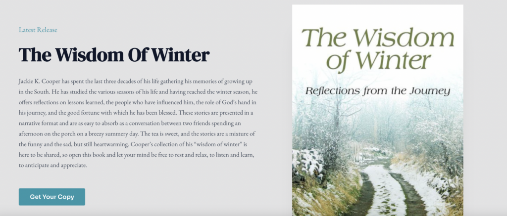
For my Final Project, I chose to redesign the website of author, movie critic, and social media personality Jackie K. Cooper. His current website lacks consistent and aesthetic typography, a cohesive color scheme, and a distinctive logo. It also hasn’t been updated with recent content since 2020. Considering he has a substantial following on YouTube and other social media platforms, has since released his 8th memoir with Mercer University Press, and frequently speaks at events, a redesign was essential for his brand. Additionally, I have a personal connection to Cooper, having assisted him with his social media strategy over the past four years.
I chose to use the Astra theme, working mainly with the Elementor Plug-In after doing extensive research on the most user-friendly editing theme.
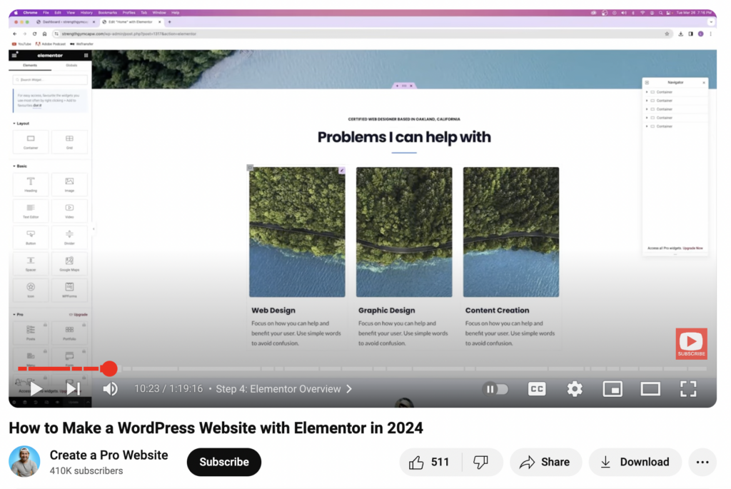
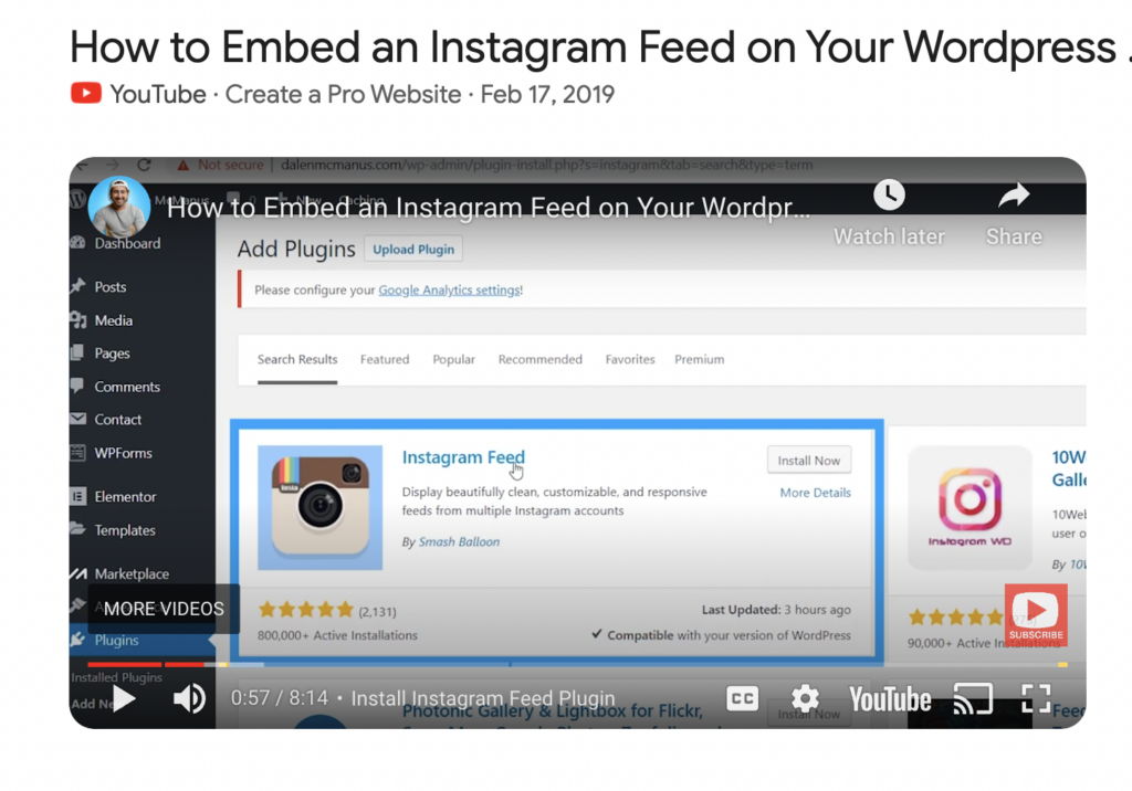
I watched this informative YouTube video to get started on my redesign.
The Development Process:
To begin, I focused on redesigning his logo. While my version may not be perfect, I do believe it portrays a significant improvement over the current logo. After creating this logo, I moved on to choosing relevant and cohesive branding colors. I chose variations of blue as this color is on brand with his most recent memoir, The Wisdom of Winter. Next, I chose EB Garamond, a clean and non-distracting font, to enhance readability and elegance. The difference in the logos are displayed below.

With these basic design elements in place, I reviewed his current website to determine relevant content for inclusion. I decided to keep some elements of the original site but tailored them to better fit his scope of work, and reduce the clutter. My redesign features a Home page, an About page, a Book Reviews page, a Movie Reviews page, a Memoirs page, and a Contact page. I chose this navigation to ensure it aligns with his current work and to enhance user experience.


My primary goal for the homepage redesign was to reduce clutter while ensuring that all important information about Cooper’s brand was easily accessible. In my opinion, a website’s homepage should present all key information about a brand or person in a concise manner, given that most users spend less than a minute on a page. For my redesign of Cooper’s redesigned homepage, I focused on showcasing these important details with an uncluttered, easy-to-digest design.
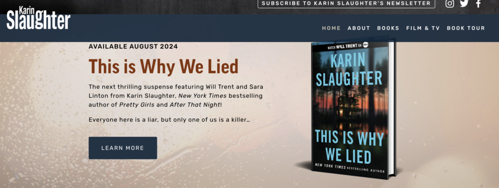
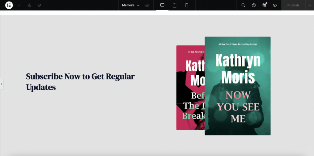
After laying out the website’s design structure, I began reworking the Home page. Analyzing successful author websites, specifically Karin Slaughter, I noted that they typically feature their latest release prominently at the top, with a call-to-action button for purchases of the book. I used this method for Cooper’s The Wisdom of Winter, something that is missing from the homepage of his current site.
I then included a photo of Cooper along with a condensed version of his About page that links to the full About page. To mitigate the outdated, cluttered carousel of movie reviews on the current site, I embedded the four most recent YouTube movie reviews directly on the homepage, and added a button to redirect users to his YouTube channel for more content. Lastly, I added a moving carousel of his books at the bottom to better promote his eight memoirs, which the current site fails to highlight effectively.
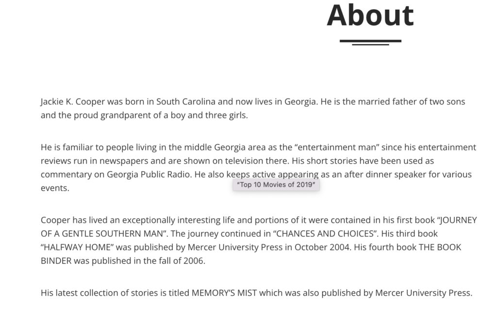
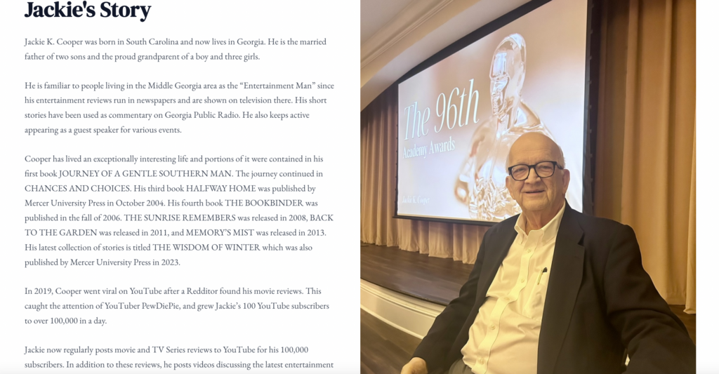
I then began working on the About page, which was notably outdated and did not reflect Cooper’s current work. I updated the content to accurately represent his personal life, achievements, and post-virality work. I included a new photo of him along with links to his social media profiles. I also highlighted his involvement with two film associations and featured a relevant quote from his latest book. I then chose to integrate his most recent book reviews from Instagram. I customized the photo and provided a direct link to his Instagram profile. Additional information on this choice is in the Challenges Section below.
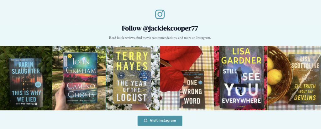
Last element on the About Page that showcases the most recent book reviews located on Cooper’s Instagram page, with a button redirecting users to his Instagram.
I then chose to implement a Book Review page, highlighting 8 of his most recent reviews. I designed this page as the “posts” page like we learned to do effectively in Project 3. I spent a lot of time posting these, choosing an image, and ensuring they were all categorized appropriately. In theory, this page would be updated every Wednesday when Cooper posts his “Writers Wednesday” book review on Instagram.
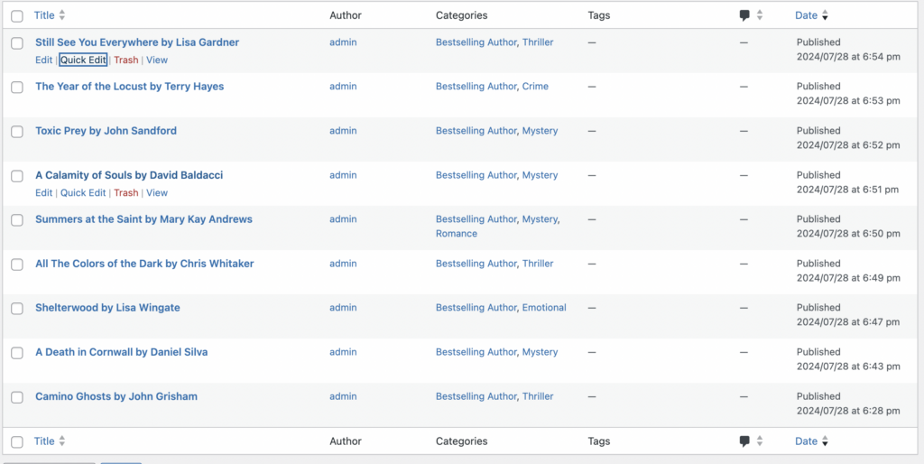
My Posts page – which showcases the latest book reviews – classified into appropriate categories.
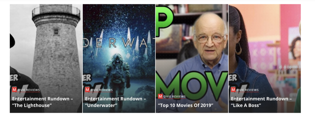
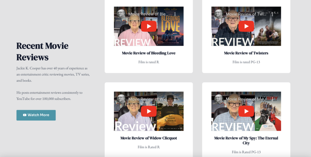
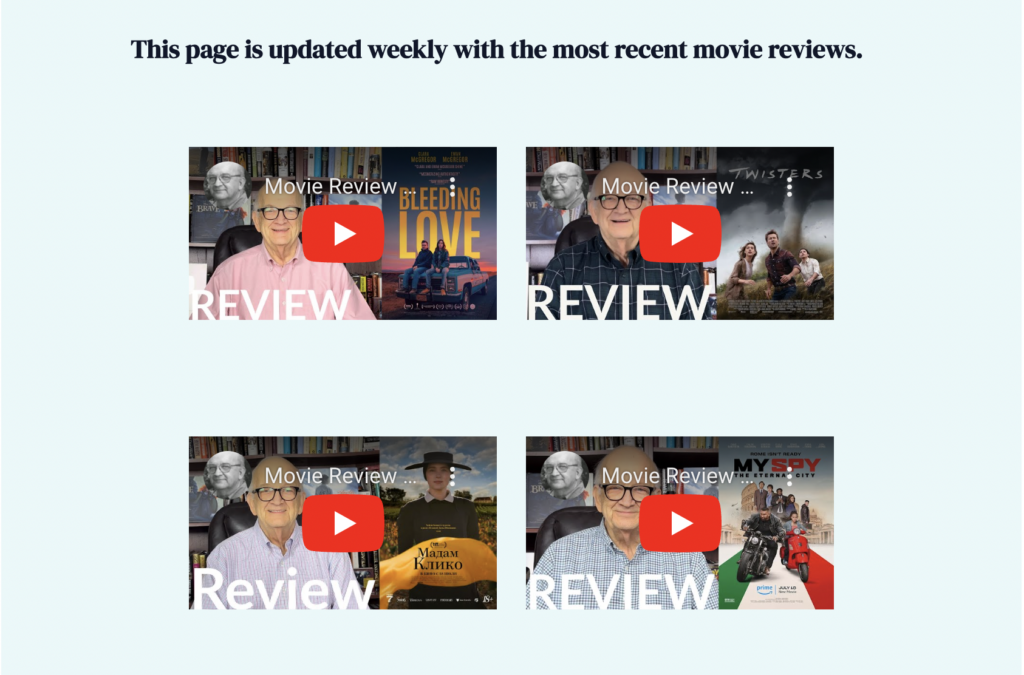
On Cooper’s current site, he has a NavBar tab titled “2 Minute Entertainment Rundown”. I chose to rename this tab to “Movie Reviews” and embed the 6 most recent movie reviews. I used a plug-in called WPForms to add an interesting element to the bottom of this page – prompting user interaction. I got rid of the news-style display of the current movie reviews and chose to implement a page with direct embed links from YouTube. In theory, this page is updated weekly to reflect that week’s posted reviews.
I got rid of the “News” NavBar tab completely, as this is irrelevant to his scope of work. I replaced it with a NavBar tab titled “Memoirs” which is more aligned with his goals. His current website does not have a dedicated page for his memoirs, so I felt as though this was very necessary. Each memoir is placed on the page with a direct link to buy from Amazon. I considered setting up an E-Commerce page for this purpose, but ultimately decided against it for several reasons listed in the Challenges Section below.
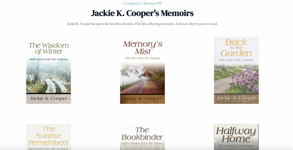
I included a grid-style layout of all Cooper’s memoirs. When clicked on, they redirect the user to his Amazon storefront to purchase.
Lastly, I kept the Contact page because all good websites need a Contact Form. This was created using the WPForms Plug-In.
Challenges:
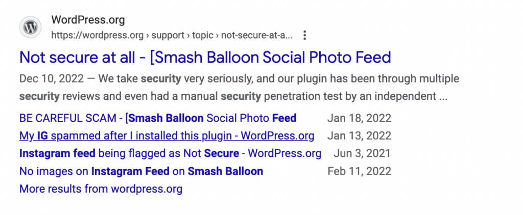
About Page: I did extensive research into Instagram Feed plug-ins, and ultimately decided against implementing the most used one – Smash Balloon Instagram Feed – due to several safety concerns highlighted in many user reviews. This was something I sought to get better at – researching and choosing safe and appropriate plug-ins! I believe I made the right choice here, at least for now, until additional research can be done on the plug-in.
Memoirs Page: I originally sought to set up an E-Commerce store with WooCommerce to sell Cooper’s memoirs. However, after multiple implementations of WooCommerce, it repeatedly failed to integrate with my site’s theme. I received several error messages and even lost viewership of my entire site when WooCommerce was activated. (Yes – I panicked) Although this was a major disappointment, I ultimately decided to create the Memoirs page that exists now with links to his Amazon storefront. I believe this decision was the best way to go, because in reality, Cooper is nearly 84 years old and will not have time or energy to package and mail every purchased book himself.
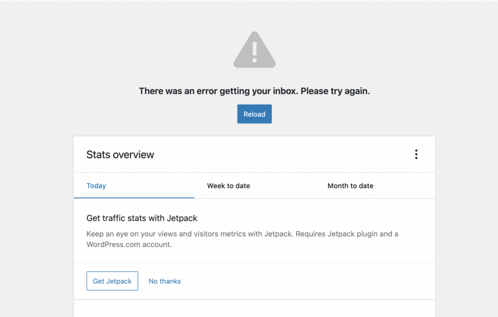
The Error Message I kept receiving when trying to set up WooCommerce.
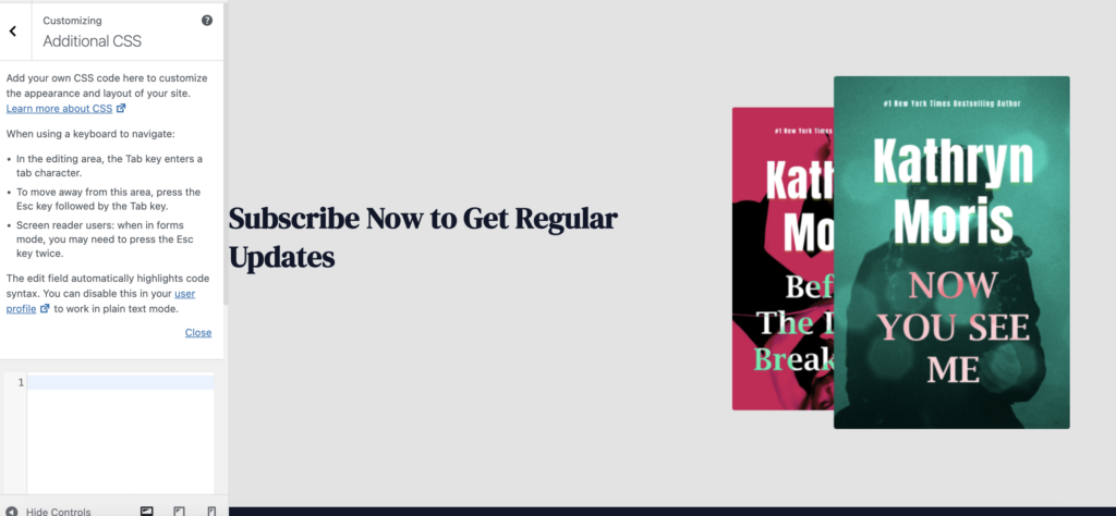
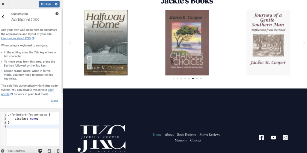
Random banner on the bottom of multiple pages: I noticed that there was random banner being displayed on the bottom of every webpage that came with the theme I chose. I searched high and low for how to remove it, because the deletion button was not an option. I chose to override it by using Custom CSS.
I believe my redesign of Jackie K. Cooper’s website showcases a foundational understanding of user-centered design, branding skills, and WordPress proficiency. The improvements I made, from the updated branding to the navigation, significantly enhance the user experience of Cooper’s current website.